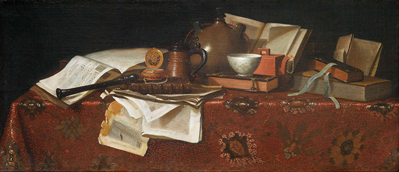
This oil painting is a fine example of the genre known as pronkstilleven, the delicious Dutch word meaning “ostentatious still life.” It’s supposed to flaunt the belongings (an English redware teapot, sumptuous table linen) and interests (books, music) of the nabob who commissioned the work. It also shows off the painter’s technical skills.
Here, the painter is believed to be Pieter Gerritsz van Roestraten (1630–1700), who was famed especially for his prowess in depicting gleaming surfaces. From Haarlem in the Netherlands, he apprenticed with the painter Frans Hals, married Hals’ daughter Adriaentje and moved to England in time to get injured in the Great Fire of London in 1666.
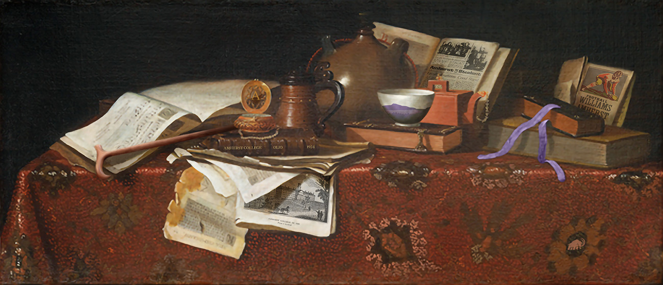
The painting belongs to the Mead Art Museum and was part of the recent Boundless exhibit. Its title is simply Still Life, and we have decided to mess with it. Maybe not ostentatiously, but enough. The top image is the work as you’d see it at the Mead. The bottom image is the same painting, but with nine Amherst-themed differences hidden inside. These flourishes boast the technical skills of another artist, Joanna Mahoney, graphic designer in the College’s Office of Communications.
— Katharine Whittemore
Your Challenge
Spot the nine Amherst-themed details in the bottom image of the painting shown here. Either print out the webpage, circle the images and send a scan of the page to us, or briefly describe the differences (e.g., “color changed on teapot,” though that is not one of the nine) and send us your written list. The scan or list should be sent to magazine@amherst.edu or Amherst magazine, Box 5000, Amherst, MA 01002.